Case Study — Metropolitan Youth Symphony of Atlanta
Services
Branding
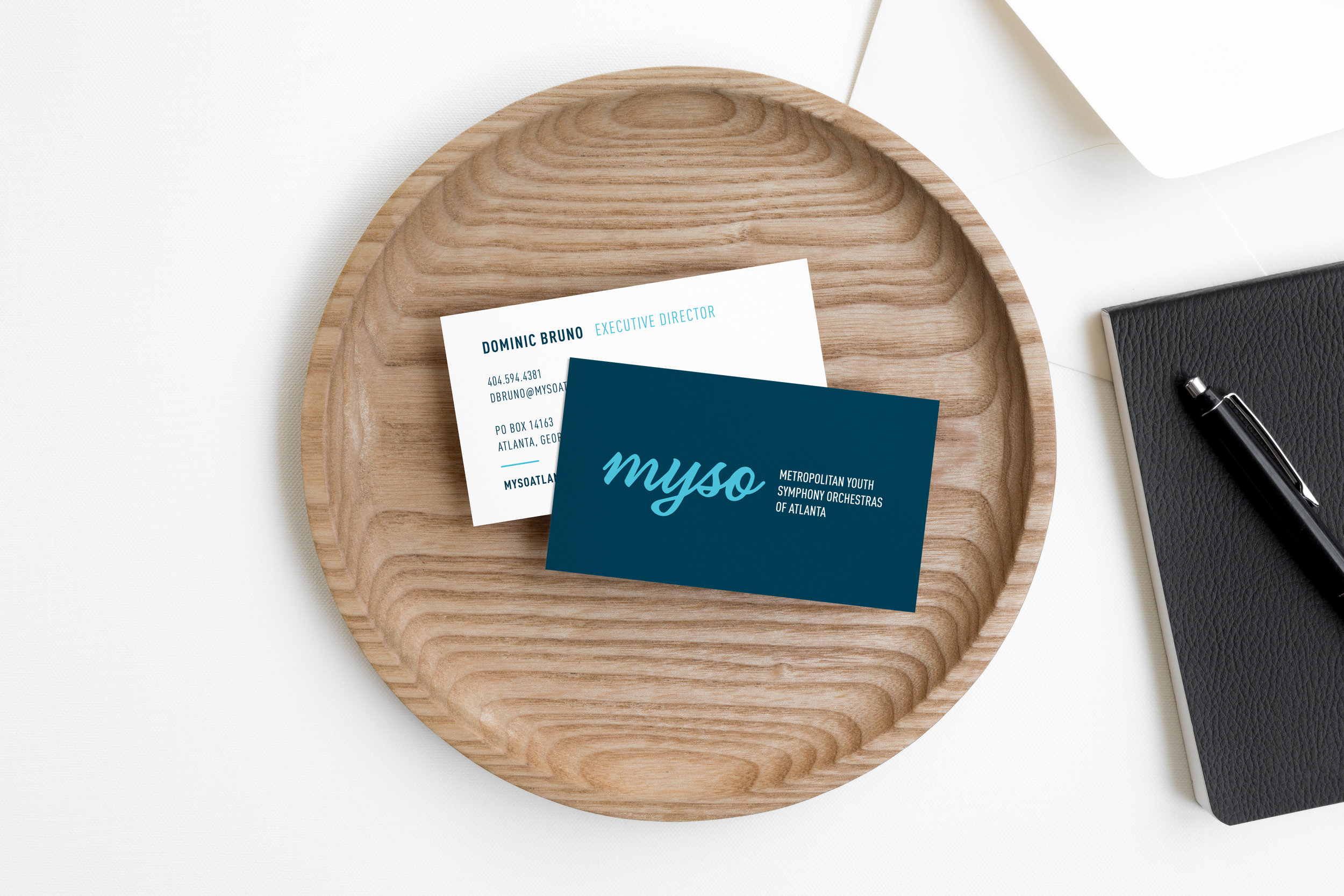
Stationery
Advertisement Design
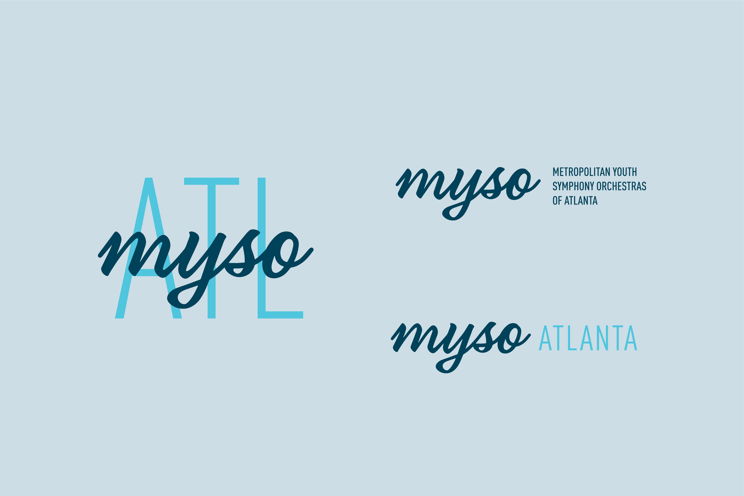
The Metropolitan Youth Symphony Orchestras of Atlanta was established in 1989 to help develop educational opportunities to Atlanta’s most talented young musicians. I was brought on board to help the organization bring their brand into the 21st century, literally. Their original logo and brand messaging were no longer attracting their audience, especially the kids they were trying to reach.
I incorporated a youthful, sign-painter style script as their main typography treatment, which played off of their original logo design but in a more approachable way. I then expanded the brand into sub-marks that could be used on various marketing materials where the whole logo didn’t need to be present. A tall, condensed ATL is paired behind the MYSO script as a secondary mark that feels playful, industrial and retro, perfect for polo shirts or tote bags.
The color palette is vibrant and colorful while maintaining monochromatic to allow the photographs of their performances to bring more color into their marketing pieces and online presence.